![]()
![]()
![]()
![]()
![]()
![]()
|
|
|
Previously, Introduction to Multivariate Anova.
Visualising group overlapWe recall our use of ±1SE error bars on the profile plots in the univariate anova which tell us if two means look to be significantly different. If their ±1SE error bars overlap, it is likely that the anova or pairwise comparisons will show their difference to be non-significant, whereas if the error bars do not overlap, they are likely to be significantly different. The idea here is to provide a "visual error oval" to suggest whether two centroids plotted on a scattergram are likely to be significantly different. In the case of the ±1SE error bar, if they do not overlap for two means, we judge that the two means differ by more than 2 SE. The "2" is an approximation, derived from the normal distribution z-score of 1.96 which provides a significance level of 0.05, or from the Student t distribution for large df when t is around 2 for α = 0.05. We suggest constructing a visual error oval a little more precisely, and using the α = 5% value of a Student's t with df appropriate for the data. In the examples we have been using, each group n is 9, hence the group's df is n – 1 = 8, and the relevant t is 2.3 to one decimal place. If used for an error bar, this would strictly be a ±1.15 SE bar, remembering that if it is two such error bars which do not overlap significance is indicated. Our error oval (§1) starts as two error bars, one laid out horizontally for the variable graphed on the X axis, and the other laid out vertically for the variable graphed on the Y axis. The vertical height of the visual error oval is thus t•SE(X axis variable), and the horizontal length is t•SE(Y axis variable). Our example scattergrams are laid out with Confidence on X and Test score on Y. With n = 9 for each variable and standard deviations of 2 and 10 respectively, SE = s/√9, so SE(Confidence) = 0.67 and SE(Test score) = 3.33. The height is then 2.3 × 0.67 and length is 2.3 × 3.33, giving 1.54 and 7.69. We draw a rectangle to the size of the error bars, and then draw an oval around the rectangle (§2) to give the start of a t•SE visual error oval, as illustrated in Figure 1 below. (§1) We are constructing our own "visual error oval" thing here; it is not to be found in any text book or web site as far as I know. Hence always called "visual error oval" here — it gives a visual impression, not a forensic calculation, of a degree of overlap of an error region between two centroids. (§2) We draw around the outside of the nicely dimensioned t•SE rectangle and not, for example, around the inside, because when placed on a scattergram the distance it represents between two centroids is more like the hypotenuse of a triangle. The dimensions of the visual error oval are increased by a factor of √2 = 1.41 to represent the idea that the oval reaches out to the corners of the SE rectangle and not just its sides. This increase is only an approximate factor because the scattergram may be laid out with an emphasis more on one variable (axis) than another, or simply to fit the space on a page. Figure 1. Constructing a visual error oval
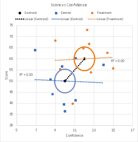
Our visual error oval is ready for use on a scattergram where the two variables are uncorrelated. In such a case, the trend lines for each group are more or less horizontal and the visual error oval of one group centroid is suited to illustrating any overlap with the visual error oval of the other group centroid. Figure 2 shows a scattergram for some example data where r between Confidence and Test score is approximately 0 for both Treatment and Control groups, and the group effect sizes are each approximately 1 (more details about this example data and its multivariate test results in Multivariate Anova part 2).
Figure 2. Scattergram of data with visual error ovals for r=0
The multivariate test shows that the two group centroids are significantly different, and indeed the visual error ovals show no overlap.
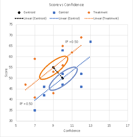
Visual error ovals for centroids of correlated variablesIf the variables are correlated, however, we align the visual error oval of a group's centroid with the group's trend line. To reflect the correlation and the distances now being measured in two dimensions along an angled trend line, we extend the oval along the trend line. To reflect the presence of correlation, we reduce the oval across the trend line. We may start with accounting for the rotation of the oval to the trend line. The trend line illustrates the correlation between the two variables, where a correlation of zero yields a horizontal trend line, and a correlation of 1 yields a trend line at approximately 45°. (Approximately, see Note §2 earlier.) Before rotating the visual error oval to align it with an angled trend line, we resize it so that, when rotated, the distance it represents along and across the trend line represents the value of the correlation coefficient, r. We use the factor 1 + r to represent these distances. The idea is to increase the error region in line with the degree of correlation on the basis that the multivariate anova requires centroids to be further apart the higher the r in order to reach significance. This factor ranges from 1 when r = 0 (no resizing), to 1.7 when r = 0.7 (70% larger), to 2 when r = 1 (100% larger). We now consider the effect of the correlation between two variables on the visual error oval for the centroid in the context of a multivariate analysis. Essentially, a multivariate analysis of the difference between two centroids taking the variables together is more sensitive to a difference which is off the trend line than one which is along the trend line. The resizing of the visual error oval to suit its rotation to the trend line adequately accommodates the desired reduction in sensitivity for differences along the trend line, but we resize the visual error oval (again) to increase its sensitivity to differences perpendicular to the trend line. This is equivalent to resizing the visual error oval on one axis only, the axis that will be laid perpendicular to the trend line. The trend line is in general and by convention laid horizontally, that is, in relation to the variable assigned to the X axis, where it is laid between 0° (r = 0) and approximately 45° (r = 1) to the horizontal. Perpendicular to the trend line is the vertical Y axis, and it is that axis of the visual error oval that is resized to be more sensitive to a difference that is inconsistent with that represented by the trend line correlation. We resize the Y axis of the visual error oval for the second time by the factor 1 – r (§3). This factor thins the oval, ranging from 1 when r = 0 (no thinning), to 0.3 when r = 0.7 (70% thinning), to 0 when r = 1 (100% thinning, the oval turns into a line). (§3) A little maths tells us that changing the size of the minor axis of the oval by factors of 1+r and then 1–r is equivalent to changing its thinness by a factor of 1 – r². Figure 3 illustrates visual error ovals placed on a scattergram where r = 0.71 and the trend line of the group centroids is inconsistent with the trend lines of the data within the groups. The multivariate test (see the earlier page for Multivariate Anova) shows that the two group centroids are significantly different, and indeed the visual error ovals show no overlap.
Figure 3. Scattergram of data with visual error ovals for r=.71
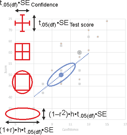
Drawing a visual error ovalAs a practical matter, drawing a visual error oval on a scattergram is most easily done by sizing the oval to the scattergram grid. This is illustrated in Figure 4, when prior results and calculations specify the values for SE, t, r, and h.
Figure 4. Drawing a visual error oval on the scattergram. The factor h is √2
Next: Multivariate Anova part 2, Multivariate Anova Part 3, Multivariate Anova part 4.
|
|
©2025 Lester Gilbert |