![]()
![]()
![]()
![]()
![]()
![]()
|
|
|
Previously: Analysis of covariance. Here we consider a number of data sets, each with a point of interest, and see how they turn out on an Ancova. Most of these data sets are also the subject of analyses using a multivariate Anova (see Multivariate Anova and Multivariate Anova part 2).
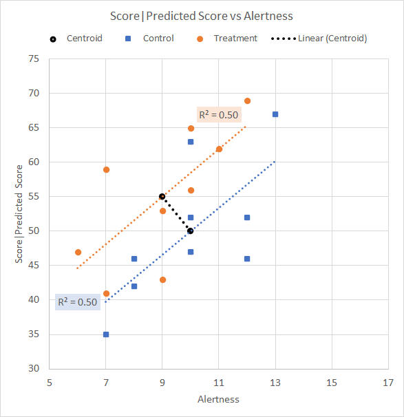
Contrary centroid trendThe data set here is the same as that from the Analysis of covariance page, except that the Treatment group has a lower mean Alertness rating than the Control group while having the higher mean Test score as before. The point is that the Treatment mean Alertness rating is contrary to the general high correlation between Alertness and Test score. The descriptives are given in Table 1. We would like to know what happens when Ancova adjusts the data so that both groups have the same mean Alertness rating. Table 1. Descriptive statistics
We plot the data on a scattergram, shown in Figure 1, and show the Anova for the Test scores (that is, without covariate adjustment) as Table 2.
Figure 1. Scattergram for contrary centroid trend data Table 2. Anova summary table for Test score (no covariate adjustment)
These are the same results as before (Table 2 of the Analysis of covariance page), there is no significant difference between the mean Test scores for the Control and Treatment groups, p = 0.30. We show the Ancova summary in Table 3. Table 3. Ancova summary table for Test score with Alertness adjustment
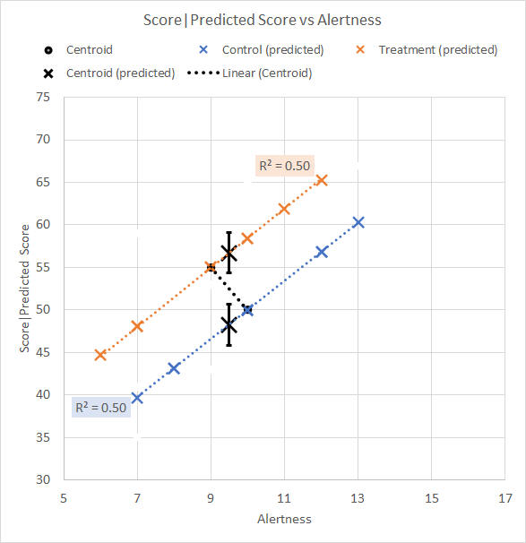
We remember to ignore the "Corrected" entry for the moment. Although eye-catching, it is not particularly relevant to our interest, which is whether there is a significant Group effect. We see from the Ancova that the difference between the mean Test scores for the Control and Treatment groups after they have been adjusted for Alertness is significant, p = 0.03. The scattergram illustrating the predicted Test scores, with ±1SE error bars, and the adjusted centroid means, is shown in Figure 2.
Figure 2. Scattergram for Alertness-adjusted data We see that the Treatment mean adjusted Test score is higher, and the Control mean adjusted Test score is lower, after each centroid has been moved along its respective group trend line to the overall average Alertness mean of 9.5. The adjusted descriptives are shown in Table 4. Table 4. Descriptive statistics for adjusted data
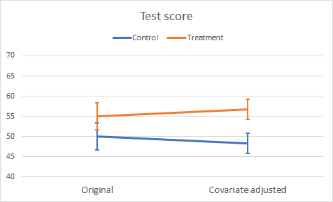
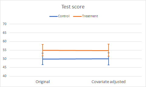
As well as the change in mean Test score, we notice the reduced standard error following the Ancova reduction of MS(Error). Figure 3 illustrates the change in mean Test scores as a profile plot.
Figure 3. Plot of original and adjusted mean Test scores
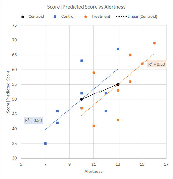
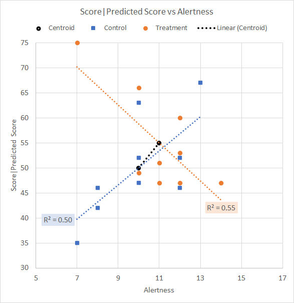
Significant group mean covariate differenceThe data set is the same as that from the Analysis of covariance page, except here the Treatment group has a much higher mean Alertness rating than the Control group while it has the same higher mean Test score as before. The point here is that the groups have a large mean difference on the covariate. The group centroids are generally consistent with the general high correlation between Alertness and Test score. The descriptives are given in Table 5. We would like to know what happens when Ancova adjusts the data so that both groups have the same mean Alertness rating. Table 5. Descriptive statistics
The data is plotted on a scattergram, shown in Figure 4, and the Anova for the Test scores (that is, without covariate adjustment) is shown as Table 6.
Figure 4. Scattergram for significant group mean covariate difference data Table 6. Anova summary table for Test score (no covariate adjustment)
These are the same results as before, there is no significant difference between the mean Test scores for the Control and Treatment groups, p = 0.30. We show the Ancova summary in Table 7. Table 7. Ancova summary table for Test score with Alertness adjustment
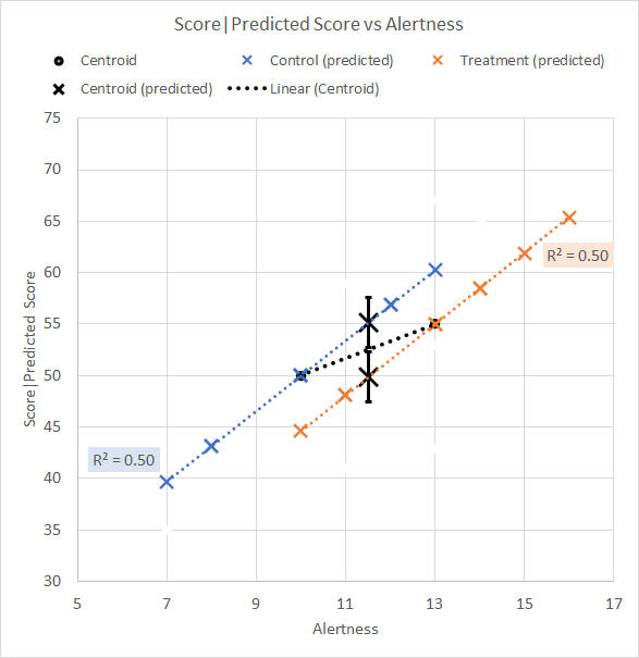
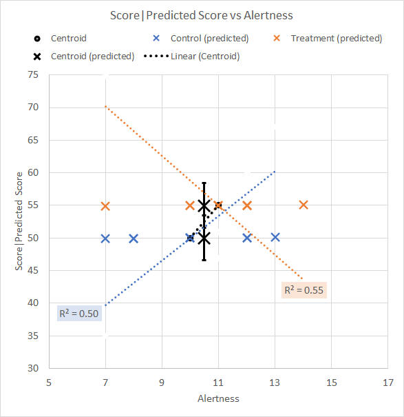
We see from the Ancova that the difference between the mean Test scores for the Control and Treatment groups after they have been adjusted for Alertness is not significant, p = 0.24. The scattergram illustrating the predicted Test scores, with ±1SE error bars, and the adjusted centroid means, is shown in Figure 5.
Figure 5. Scattergram for Alertness-adjusted data We see that the Treatment mean adjusted Test score is lower, and the Control mean adjusted Test score is higher, after each centroid has been moved along its respective group trend line to the overall average Alertness mean of 11.5. The adjusted descriptives are shown in Table 8. Table 8. Descriptive statistics for adjusted data
As well as the change in mean Test score, we notice the reduced standard error following the Ancova reduction of MS(Error). Figure 6 illustrates the change in mean Test scores as a profile plot.
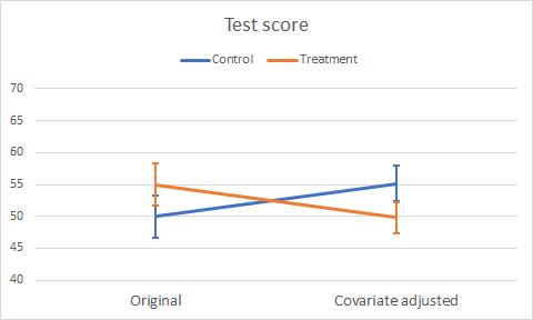
Figure 6. Plot of original and adjusted mean Test scores WAIT! Did you see that coming? Were you just nodding along and quietly saying, "Get on with it"? The Ancova has reversed the trend of the Test scores, such that the Treatment group mean is now not that far away from being significantly *lower* than the Control (notice how the ±1SE error bars barely touch). The issue arises because of the significant difference in mean Alertness rating between the groups (§1). The point of this little demonstration is to show the importance of checking that there is no significant difference in the covariate means before running an Ancova. In fact, an Anova on the covariate should always be a routine check. Here is the Anova we didn't do, Table 9. (§1) Go back to the scattergram of Figure 5, and conceptually drag the group centroids back and forth along their group trend lines to see, and so understand, how this unexpected reversal takes place. Table 9. Anova summary table for Alertness rating
There is a highly significant difference between mean Alertness ratings for the Control and Treatment groups, p = 0.01. This throws into question the basis for using Alertness as a covariate in the adjustment of the Test scores. We will pick up on this issue in Covariance part 3, but for the moment we recognise that the Ancova may not be an appropriate procedure on this data. Because of the significant covariate mean difference, an alert reviewer or Editor will question the use of Ancova and suggest its removal from your paper in a major revision.
Inconsistent group correlationFinally, we explore the situation where one group shows a positive correlation between variate and covariate, and the other group shows the opposite. Our data is engineered to have r = 0.71 in the Control group data as before, but r = –0.74 in the Treatment group. The descriptives are given in Table 10. As before, we would like to know what happens when Ancova adjusts the data so that both groups have the same mean Alertness rating. Table 10. Descriptive statistics
We have early warnings of the interesting times ahead in Table 10, first from the opposite signs of the group correlation, and second from the average r which is approximately zero. We know that the average r is used to adjust the Test scores; does this suggest that adjustments will be negligible? As always, we plot the scattergram of the data, shown in Figure 7.
Figure 7. Scattergram for data with inconsistent group correlations (Just a small note in parentheses. See how the R² value disguises the negative r. If you were just glancing through numbers without graphing the data, particularly if you were just looking at a Regression headline results table, you would not know that you were about to jump to a nonsense conclusion.) We can skip the Anova summary for the Test scores, it is identical to Table 2 and Table 6 here and Table 2 in the Analysis of covariance page. The bottom line from the Anova is that there is no significant difference between the mean Test scores for the Control and Treatment groups, p = 0.30. So, straight to the Ancova, shown in Table 11. Table 11. Ancova summary table for Test score with Alertness adjustment
As we might have suspected from the average r, the Ancova suggests little change to the Anova finding. After adjustment for the covariate, the Group effect remains insignificant, and at around the same level, p = 0.34. We plot the scattergram for the Alertness-adjusted predicted Test scores, as shown in Figure 8.
Figure 8. Scattergram for Alertness-adjusted data The Figure 8 scattergram clearly illustrates that the predicted Test scores and the adjusted mean Test scores are in relation to the average r, that is, the average trend between Alertness and Test score as seen in the groups (§2). The Ancova shows adjusted mean Test scores which have barely changed from their unadjusted values, and a standard error for these means which similarly is more or less the same as the SE for the unadjusted means. Table 8. Descriptive statistics for adjusted data
Figure 9 illustrates the change in mean Test scores as a profile plot. There are no surprises here because nothing has changed.
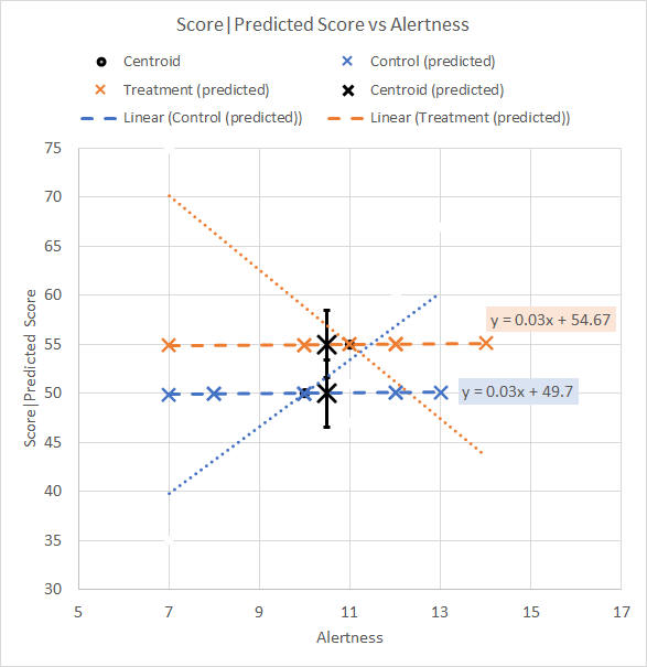
Figure 9. Plot of original and adjusted mean Test scores (§2) We can see that we do not slide a group centroid along one or other of the group trend lines as shown in the figure. To slide the centroids along a trend line that uses the pooled r, we must imagine (or draw) a trend line (a) passing through the centroid, and (b) whose slope is halfway between (the average of) the slopes of the different group trend lines. Perhaps an easier approach is to plot the predicted Test scores as provided by the "Save" button in the SPSS Ancova. Figure 10 shows the trend lines for the predicted Test scores and their trend line equations as provided by Excel.
Figure 10. Trend lines and equations for predicted Test scores
Homogeneity of covarianceWe must now visit the issue of the heteroscedasticity (§3) we see in the data of our last example on this page. It is significant, and so we have a violation of one of the assumptions of the Ancova, that the correlation seen between variate and covariate is the same in each group and that any differences are due to random sampling error. (§3) Who doesn't love mentioning a certain "heteroscedasticity" in their data at the dinner table? I tend to restrict myself to mentioning "lack of homogeneity" instead after a glass or so of wine, and of course to mentioning nothing at all with the second bottle. We discuss heteroscedasticity at some considerable length in the Multivariate Anova part 4, and the same issue arises in the analysis of covariance. The difference is that the test for heteroscedasticity, Box's M, is not offered in the SPSS dialogue for the Ancova, ever though Anacova is obviously a multivariate technique. Only tests for homogeneity (§4) are on offer, and this data set passes them all with flying colours. We must look at the scattergram and plot the trend lines to see if heteroscedasticity might be an issue. If we are suspicious, then we would run the data as though a Manova and tick the Box M test from the Options button. (§4) Homogeneity is a similar concept to homoscedasticity, but in the statistics literature is usually applied to variances, and to error variances in particular. The test for homogeneity arises from the need to check the assumption behind the pooling or averaging of cell variation in the Anova in constructing the MS(Error) term. Homoscedasticity applies to the covariance matrix and the need for its test arises from the assumption behind the pooling or averaging of covariances in the Manova to give the average r for predicting the covariate's adjustment to the variate.
Next: Covariance part 3, where we consider the possible justification of the use of an Ancova for a data set.
| |||||||||||||||||||||||||||||||||||||||||||||||||||||||||||||||||||||||||||||||||||||||||||||||||||||||||||||||||||||||||||||||||||||||||||||||||||||||||||||||||||||||||||||||||||||||||||||||||||||||||||||||||||||||||||||||||||||||||||||||||||||||||||||||||||||||||||||||||||||||||||||||||||||||||||||||||||||||||||||||||||||||||||||||||||||||||||||||||||||||||||
|
©2025 Lester Gilbert |